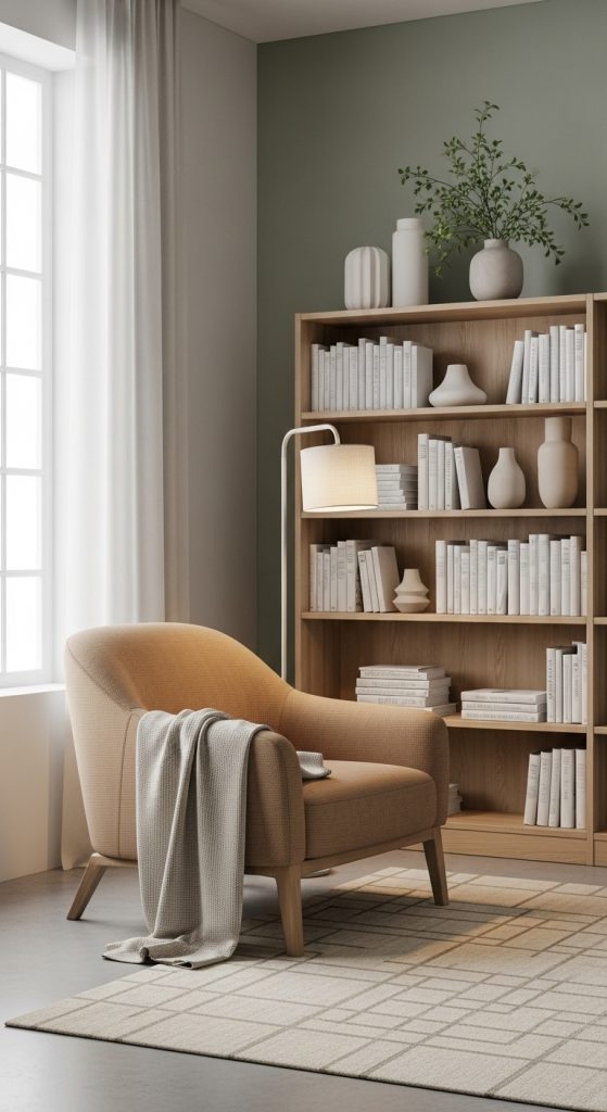
6. Choose a Calming Color Palette
Color has a powerful effect on mood, and your reading room’s palette should inspire peace and focus. Soft, muted tones work best for a cozy reading space. Shades of cream, beige, light gray, or pastel blue are timeless choices. If you want more warmth, go for earthy hues like terracotta, sage green, or warm browns.
Accent walls or wallpaper with subtle patterns can add charm without being distracting. The goal is to create a tranquil environment that encourages relaxation.
For small spaces, lighter colors make the area feel more open and airy, while darker tones can make larger spaces feel intimate and cocoon-like.