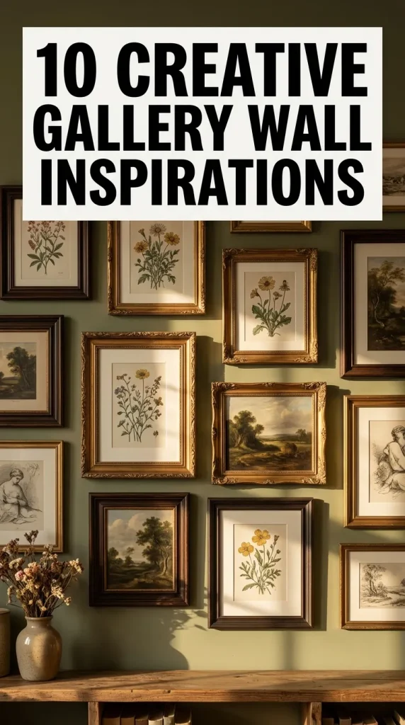
10 Gallery Wall Prints Ideas

Spread the love

A curated gallery wall is one of the most effective ways to introduce personality, color, and architectural interest to an empty room. Whether you are decorating a sprawling living room wall, a cozy bedroom nook, or an entry hallway, bringing together art prints, photographs, and illustrations turns plain drywall into a dynamic focal point.

This guide breaks down 10 creative gallery wall print themes, complete with framing layouts, color coordination strategies, and styling tips to help you design a cohesive display.

Why a Gallery Wall Works

Gallery walls bridge the gap between interior design and personal storytelling:

  • Visual Balance: Fills large wall spaces without requiring a single, expensive massive artwork.
  • Versatility: Allows you to mix different art mediums—such as vintage line art, modern abstract graphics, travel photography, and botanical sketches—into a unified composition.
  • Easy Customization: Prints can easily be swapped, re-framed, or expanded as your personal taste evolves over time.

Framing & Hanging Essentials

Before hammering nails into the wall, gather your tools and plan your layout to ensure a clean, balanced execution.

Recommended Materials & Tools

  • Framing Supplies: A mix of matching or contrasting frames (wood, black metal, gold leaf, or acrylic).
  • Mat Boards: Acid-free mats in white, off-white, or black to give prints breathing room inside their frames.
  • Layout & Mounting Hardware: Kraft paper (to cut out frame templates), painter’s tape, tape measure, spirit level, picture-hanging hooks, and a pencil.

Layout Pro Tip: Cut paper templates matching the size of each frame, tape them to the wall using painter’s tape, and adjust your arrangement until the spacing feels balanced before hanging.

10 Creative Gallery Wall Print Ideas

1. Modern Abstract & Minimalist Line Art

Setup Method

A clean, contemporary layout prioritizing simple geometric forms, fluid brushstrokes, and neutral tones.

  • Print Style: Continuous line drawings, abstract arches, neutral watercolor splotches, and minimalist typography.
  • Color Palette: Warm beige, oatmeal, charcoal black, terracotta, and soft cream.
  • Framing Strategy: Thin, uniform black or light natural oak frames with wide white mats for a museum-like presentation.

2. Vintage Botanical & Floral Herbarium

Setup Method

Brings nature indoors with a timeless, Victorian-inspired scientific aesthetic.

  • Print Style: Antique botanical illustrations, vintage fern prints, pressed flower art, and vintage fruit sketches.
  • Color Palette: Forest green, sage, olive, muted mustard, and aged sepia parchment backgrounds.
  • Framing Strategy: Ornate gold filigree frames or dark walnut wood frames arranged in a tight, symmetrical grid layout.

3. Moody Architectural & Black-and-White Photography

Setup Method

A dramatic, high-contrast arrangement suited for modern entryways, staircases, or behind a sofa.

  • Print Style: High-contrast urban architecture, monochrome landscape photography, structural shadows, and close-up street scenes.
  • Color Palette: Pure black, crisp white, slate gray, and charcoal.
  • Framing Strategy: Thin black aluminum frames set with oversized white matting to create striking depth against light or dark walls.

4. Warm Tuscan Travel & Coastal Landscape

Setup Method

Evokes memories of summer vacations, European countrysides, and serene ocean shores.

  • Print Style: Sun-drenched Mediterranean doorways, aerial beach shots, coastal cliffs, and vintage travel poster illustrations.
  • Color Palette: Terracotta, azure blue, sand beige, warm olive, and sunny yellow.
  • Framing Strategy: Rattan, light maple, or white painted wooden frames arranged in an asymmetrical, relaxed grid.

5. Mid-Century Modern Geometric Shapes

Setup Method

Infuses playful retro energy into a living room or home office using bold graphic motifs.

  • Print Style: 1970s geometric patterns, overlapping color-block circles, Bauhaus exhibition posters, and abstract sunbursts.
  • Color Palette: Mustard yellow, burnt orange, teal, dusty rose, and dark olive.
  • Framing Strategy: Mid-century teak or dark walnut frames kept simple to highlight the vibrant graphic artwork.

6. Eclectic Thrifted & Maximalist Mix

Setup Method

A curated “collected over time” look that blends different eras, art mediums, and frame styles.

  • Print Style: Oil painting reproductions, quirky portrait sketches, vintage typography, abstract splashes, and small sketches.
  • Color Palette: Rich jewel tones mixed with earthy neutrals—emerald, burgundy, navy, and gold.
  • Framing Strategy: Deliberately mismatched frames—combining ornate thrifted brass, carved wood, black metal, and mirror frames in a salon-style hanging layout.

7. Serene Japandi & Wabi-Sabi Ink Wash

Setup Method

Emphasizes calm simplicity, organic textures, and open negative space for a tranquil atmosphere.

  • Print Style: Japanese sumi-e ink wash paintings, muted stone textures, delicate bamboo sketches, and soft watercolor clouds.
  • Color Palette: Soft greige, warm stone, washed linen white, and subtle charcoal accents.
  • Framing Strategy: Minimalist, thin natural pine or light ash wood frames without mats to keep the focus on organic textures.

8. Retro Pop Art & Typographic Posters

Setup Method

A high-energy, youthful display that turns bold phrases and colorful graphics into modern wall art.

  • Print Style: Bold typography quotes, retro pop art illustrations, vintage magazine covers, and vibrant graphic icons.
  • Color Palette: Electric Cobalt, bubblegum pink, bright red, sunshine yellow, and cream.
  • Framing Strategy: Sleek white or bright acrylic neon frames set in an asymmetrical, staggered arrangement.

9. Dark Academia Moody Oil Painting Portraits

Setup Method

Creates a cozy, scholarly sanctuary feel perfect for studies, libraries, or moody bedroom walls.

  • Print Style: Classical Dutch golden age oil painting prints, dark landscape scenes, vintage portrait paintings, and moody cloudy skies.
  • Color Palette: Deep mahogany, forest green, navy blue, antique gold, and deep plum.
  • Framing Strategy: Heavy, antique brass or ornate dark wood frames hung closely together to cover a dark accent wall completely.

10. Pastel Coastal Cottage & Floral Garden

Setup Method

A soft, cheerful aesthetic ideal for sunny breakfast nooks, nurseries, or cottagecore bedrooms.

  • Print Style: Impressionist floral watercolors, pastel landscape sketches, coastal beach dunes, and delicate garden sketches.
  • Color Palette: Blush pink, soft sky blue, sage green, lavender, and butter yellow.
  • Framing Strategy: Painted white wood or distressed whitewashed frames arranged in an airy, balanced grid.

Common Beginner Mistakes to Avoid

  • Hanging Prints Too High: A common error is positioning the center of the gallery wall too close to the ceiling. Aim for the eye level standard: the center point of the entire gallery group should sit roughly 57 to 60 inches from the floor.
  • Inconsistent Spacing: Uneven gaps between frames make a gallery wall look chaotic rather than curated. Maintain a consistent distance (typically 2 to 3 inches) between all frame edges.
  • Ignoring Frame Scale: Placing only tiny frames on a massive living room wall makes the artwork look lost. Mix larger statement frames (e.g., 16×20 or 18×24) with medium and smaller pieces to ground the arrangement.

Practical Styling Tips

  • Unify with Color or Frames: If your art styles vary wildly, keep the frame color uniform (e.g., all black frames). If your frames are completely mismatched, keep the color palette of the prints cohesive.
  • Anchor Above Furniture: When hanging a gallery wall above a sofa or console table, ensure the width of the entire art arrangement spans about 60% to 75% of the furniture’s total width.

Frequently Asked Questions

How far apart should gallery wall frames be spaced?

As a general rule, space frames 2 to 3 inches apart. For smaller frames or tighter grids, 1.5 to 2 inches works well, while larger statement pieces can handle 3 to 4 inches of breathing room.

Can you mix frame colors on a gallery wall?

Yes! Mixing frame colors (like gold, black, and natural wood) creates a rich, curated look. To keep it intentional, repeat each frame finish at least twice across the display so no single frame looks out of place.

How do I hang a gallery wall without damaging rental walls?

Use heavy-duty picture hanging adhesive strips (like Command strips) rated for the weight of your frames. Ensure you clean the wall with rubbing alcohol beforehand and press firmly during installation.

Similar Posts

  • 10 Kids Game Zone Business Ideas

    Spread the love

    Spread the loveStarting a kids game zone business can be an exciting and rewarding journey. With parents constantly searching for safe, fun, and creative spaces for their children, there is a growing demand for well designed entertainment zones. A kids game zone can be a profitable venture whether it is built in a mall, a…

  • 10 Sculptures for Home Interior

    Spread the love

    Spread the loveSculptures have long been a symbol of artistic expression, culture, and personal taste. In modern home interiors, sculptures are no longer reserved for museums or grand halls. They are now an essential decor element that adds depth, character, and emotion to living spaces. Whether your home style leans toward modern minimalism, classic elegance,…

  • 10 Modern Minimalist Bedroom Ideas

    Spread the love

    Spread the loveCreating a modern minimalist bedroom is one of the most effective ways to bring calm, clarity, and comfort into your home. Minimalism is not simply about having fewer items. It is about choosing each element with intention and ensuring the room feels open, balanced, and serene. A minimalist bedroom is peaceful and uncluttered,…

  • 10 Woodworking Tools Storage

    Spread the love

    Spread the loveA woodworking shop is often the creative haven where ideas come to life. But as rewarding as woodworking is, keeping tools organized can sometimes feel like a never-ending challenge. Whether you have a large workshop, a garage corner, or even a small shed, efficient tool storage is essential. Without it, you may find…

  • 10 Plant Ceiling Decor Bedroom

    Spread the love

    Spread the loveDecorating a bedroom is about creating a space that feels peaceful, personal, and comforting. One of the most creative and visually stunning ways to elevate bedroom decor is by bringing plants upward. Plant ceiling decor transforms unused vertical space into a living design feature that adds warmth, texture, and natural beauty. Ceiling plant…

  • 10 Cozy Corner Art Room

    Spread the love

    Spread the loveCreating a cozy corner art room is one of the most rewarding things you can do for your creativity and peace of mind. Whether you are an artist, crafter, or simply someone who loves to sketch, paint, or make things with your hands, having a little space dedicated entirely to art can completely…

Leave a Reply

Your email address will not be published. Required fields are marked *